Tuesday, September 29, 2015

Brandon Harrell - Weekly Artist Post #7


1.     Lovejoy is most likely using a digital format for his photographs. It is not clearly stated whether or not he is using analog or digital. In addition to this, he is also utilizing color format. It appears that he is using a higher saturation setting on his camera, documenting the bright vivid colors that come out of these mixtures.
2.     His subject is something that is very interesting- taking paints and inks and blending them together, then taking a photograph of the end result. The various liquids in topic are not completely mixed together, and have a very glossy look to the mix, hence the bright highlights in the picture.  Predominately, it appears he is using various paints, due to the sheer amount of colors that appear in the mixes. He has also used oil, resin, diluents, drying agents and waxes to add to his mixtures to create a different effect each time. He has done this project for several years, and has posted thousands of pictures like the ones featured online.

3.     I personally found genuine interest in Lovejoy’s work. While most photographers make pictures of scenery, people, or even parking lots, he is finding new ways to explore what he put his camera to use for. I also find very interesting in the dynamics of these various liquids interacting with each other, some of which appear to make an actual image in the blend.

Monday, September 28, 2015

Mayteana's Weekly Post 7


1. Asger has a very unique outlook on photography and he strives to push boundaries and create art. His images are done in black and white, appearing to be a couple feet from his subjects. His style is about body manipulation. His work is a composite of photography and Photoshop melded together as one.
 
2. In the first image at first glance it appears that the image is of an ordinary scene, a brief meeting or encounter, but upon further examination you can see that the guy on the left has two pairs of eyes and a longer deformed nose. The image is simplistic yet startling. In the second image it appears to be a mother and son taking a family picture possibly. What stands out is the boys one eye. Though they smile like nothing is out of the ordinary. In the last image a girl is posing on the floor but her bottom half is completely made of wooden planks.
 
3. I chose these images because they stood out. The simple nature you get from the body language from the subjects is such a contrast to what the actual image shows. It makes me feel uncomfortable but intrigued at the same time. The melding of Photoshop and photography is done so well you can not tell that it has been manipulated and that is what led to me bypassing some of the strange things occurring in the images.


Deja Thompson - Weekly Artist Post 7

Andrea Modica


1) Andrea Modica uses black and white. It seems that she is shooting with a digital format camera. The first picture the subject is off to the left. In the second picture the subject is centered and the last picture the subject is off to the right. In second picture Monica is at least 15 feet away where as the others are 50 to 100 feet away. The first picture captures the motion of the sea grass. They all use a large F-stop maybe f22 or higher to gain a greater depth of field.

2) The first picture is of someone floating in a river possibly relaxing in the calm of the water. The last two are a bit more violent. The second picture is of a decapitated donkey head. The last seems to be of a dead cow or another large grazing animal.

3) The top picture show the beauty of life. Actually getting to take some time and spend it taking in your surroundings. The second picture is an example of a horrible ending to life with the head hanging from the tree. The last picture is of what appears to be dead because usually animals to do not lay on their sides like that. These pictures make you want to go out and enjoy life because when its over its over.

Sunday, September 27, 2015

Ashanti Neverson - Weekly Artist Post 7

Carl Fischer


1.) Carl Fischer shot many covers for Esquire. With these covers he shot in analog using color. Since they are for a magazine the subjects are mostly centered. He seems to be within three to seven feet away from his subjects. They are well lit to give a clear message for the cover of the magazine with colors complementing. The middle picture is actually a picture of a picture but the photographer has added their hand for affect. 

2.) The first picture of Muhammad Ali was controversial as he is being depicted as a Christian saint and he was a converted Muslim. Fischer used his own hands wiping at JFK eyes. The photo was edited to look distressed and old giving it a nostalgic feel. The last photo shows black men in an ice box "keeping it cool" for their summer issue. In the 60's the summer started meaning race riots so the article focuses on how to keep it cool.

3.) To me the first picture with Muhammad Ali shows how much criticism he took for the things he said and did. He was sort of like a martyr for not being afraid to be yourself and being proud of who you were. The second photo of JFK having his tears wiped away was sort of like his problems being wiped away. He wouldn't have to suffer anymore since he past. The men on the last cover are being cool while in an icebox. With the race riots and violence that went on during the summers I think it was a clever idea for their cover. 

Deja Thompson - Weekly Artist Post 6

Anders Petersen


1) Anders Petersen uses black and white. It is unclear to which medium he is using. All of his subjects are center waited. The colors seem to be contrasting each other. With each picture Petersen is standing within 6 feet of his subjects. In the second picture it appears that he is using a fast shutter speed maybe 1/250 because the wings of the birds are almost stand still.

2) These pictures are about enjoying life. The first is of a boy smiling at something which obviously brings him great joy. The next is of a person holding out their hand with food for the birds. Allowing one bird to sit on his hand while he embraces his surroundings. The last is of a couple sharing a kiss or possibly sharing a secret. Or they could not possibly not even be a couple and just be two friends enjoying their time together.

3) I think it's nice to see people out and just enjoying their self. Often we see the busy worker or someone in a hurry but with this you see people just enjoying their lives. These pictures show you joy, emotion, happiness, love and also peace. It's nice to see people experiencing the moment rather than rushing through it.

Dawit Samson - Weekly Artist Post 7


1.) John Gossage uses composition, lighting, and appropriate subject choices to tell a story about 'nothing'. In the first picture Gossage captures the road from a different angle than usual, and this angle makes the road seem as if its going up to 'nothing'. His choice of subject matter in the second photo is impressive. He has two dead plants,  with destroyed construction in the background and a pile of dirt and debris in the mid. This gives it depth, and makes the story deeper as well. In the final photo, Gossage uses the lighting to his advantage. The box is lit on the outside so the viewer can see what it read, "Made In U.S.A", but inside it is pitch black. 

2.) Maybe the reason for having the inside of the box be pitch black is to symbolize that U.S.A. is now nothing. The theme of nothingness in these pictures can give the viewer a sense of unawareness. Unawareness of the setting. Is it in the future. Is it in the past. The use of black and white helps enhance this unawareness. 

3.) Gossage uses wonderful technique to show 'nothing'. If one was set in the same setting Gossage was in when taking these photos, one might assume that there is nothing to capture. However, Gossage figured out that maybe the nothing is something to capture. Maybe that nothing used to be something, so that nothing is just dead form of something. Gossage really captured something out of what others might say nothing, in a beautiful way. 


Max Goossens - Weekly Artist Post 7

Carly Steinbrunn
"The Voyage of Discovery"


Carly Steinbrunn has a very interesting way of shooting her pictures. In many of her pictures part of them seem to disappear into the background or simply off the edge of the photograph. I am not sure if this technique is done in photoshop(or dark room if these are film), or while the pictures are being taken. Steinbrunn also seems to have the same tone throughout all of her images, a more faded, washed out look.
Steinbrunn's theme  seems to jump around a little bit throughout the entirety of her 'The Voyage of Discovery' collection. However several of the images seem to stick with the landscape of natural elements of the area and less so on commercial aspects. But on occasion you will find an image of a article of clothing or text.
I really enjoy Carly Steinbrunn's 'The Voyage of Discovery', I find the way she frames and the style in which she shoots her images to be very interesting. I also think that the way Steinbrunn uses her knowledge of color to unify the images into almost one collaborative piece is very unique. As a photographer I would like to be able to shoot in a similar way to give my body of work a similar feeling of unity.

Betty Gowans - Weekly Artist Post 7

Christopher Anderson


In this series, Anderson mainly uses black and with photography, and sometimes with an infrared filter. The first and third images are examples of this. When he does use color, it is typically red, white, and blue that make up most of the images. It is difficult to tell if he is using a high or low depth of field in these images because he is cropped in so closely on his subjects - so much so that they become the composition as opposed to just being part of the composition. In most cases, lighting is harsh. The way he chooses to place points of focus changes with each image. The first focuses roughly on the thirds line in the center, on the subjects mouth, and the composition is very much center weighted. The second also centers the subjects features, however her eyes are right in the vertical middle of the composition - splitting up the composition into halves. Finally, the third is weighted towards the left, with the eyes and lips roughly on thirds lines. The first and third have high contrasts.

These images are meant to be about the pomp and glamour of politics, by showing just the opposite - politicians and campaign supporters in highly unflattering lights. He presents these people in crude and nontraditional portraits that most likely none of these people would enjoy seeing themselves in. It pokes fun at something fairly serious. They capture the "goof ups" on the campaign trails and freeze the subjects at just the perfect beautiful moment where they aren't smiling perfectly for the camera, they're yawning, laughing, awkwardly in between faces, etc. Anderson uses all of the above mentioned techniques to achieve all of this. He is removing the glamor from what he we all see and placing these people on pedestals that they wish they had never been put on.

I enjoy these mainly because they do possess a statement behind the images. Normally I don't care for images such as these, but they are beautifully crude and allow me to see politicians as more than the visage on the campaign trails. It is much different than what you see from an Associated Press photographer.

Weekly Post #7 Karissa Gilbertson, Sebastien Laval for Sept 28st

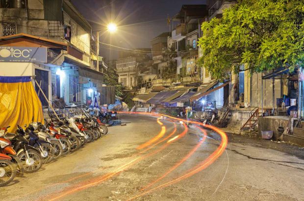
16Hanoi_Night_34


5

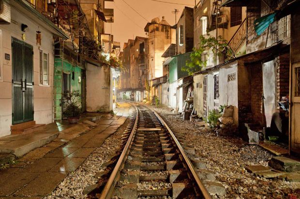
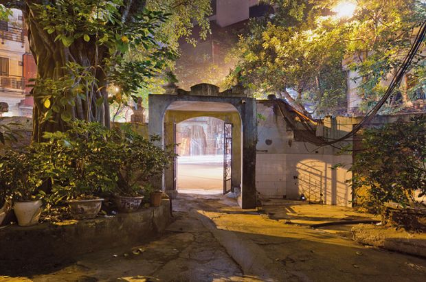
    French photographer  Sebastien Laval  captured essence of the soul of Hanoi when he took these!  These photos are still and movement night shots done in color.  Leval has been in love with Hanoi the city in Vietnam since 1995 when he was there with acquaintances.  He captured places not easily found and wanted to show the heart and soul of the people and places of this city.

  The pictures shown above are some of the night scenes and a morning scene where you can visibly feel a pulsating life coming form the photos. The photos are surreal in feel and have a life of their own in each shot.  You can feel movement in the streets as you see a red streak where you know a car was but the car it's self is not visible but you can feel the life of the car and the people coming from the photo.

  This is probably my favorite set that I have blogged on.   Wow! I mean wow! These photos are amazingly fantastic! I love Levals work and I am now a fan.  After reviewing these pictures if I had an idle or a mentor this is who I would want to work with!  I love the feel of these and I love the look.  Leval is the artist I inspire to live up to someday!


Lauren Reynard weekly artist post 7

Mark Sherratt


1. Mark Sherratt is a photographer based in London. From what i can see he shoots all different kinds of photos from portraits to landscape and people. In these particular works he captures people in action doing various activities. The use of color and light is impeccable and the use of shutter speed as well as aperture is also very well done.

2. The colors in all three photos are extremely vivid and show alot of craftsmanship with exposure. He uses a very fast shutter speed in all of the pictures to capture the water droplets, the skateboarder, and the child hanging upside down. All of the photos also show alot of motion even without actually being in motion. The viewer know what is about to happen in each photo and they can play these scenarios in their mind.

3. I think i chose these pictures because of all of the bright vivid colors and because of how interesting they are. The photos are funny, cute, and portray motion which makes them have interesting compositions in themselves. They are very well done and they make me happy just by looking at them.

Parker Austin Weekly Artist Post 7

Fred Herzog


1) Fred Herzog was a German Photographer, but is mostly know for taking pictures, such as these, in Vancouver, Canada. The name of this collection is color. He took pictures of people in public setting mostly from the front but has a few from behind such as the first one. He used Kodachrome slides because he believed them to be the best for the time of his work. taking all of his pictures from a few feet back from his subjects and posing as much color into east photo as he could.
2) His use of color was definitely stand out in all of his photos, some a little bit more aware than others but still colorful. He used the them of neon signs and a reoccurring CocaCola theme is a few of his photos. Due to the amount of color in each photo is draws the attention but still leaves something to look at for a long time. 
3) I like these photos a lot and not just because of the color, though it does leave me with a happy feeling. Each photo has its own story and reaction and basically its own life. There is a whole other life to these people that we are catching a glimpse of and it speaks its self so well.

Mary McCarter- Weekly Artist Post 7


 Wylie uses a combination of line, color, and shape in his photos of these three very different landscapes. Using the sky as a rather subdued and blank background, Wylie highlights the landscapes by framing them with this light. He clearly does this to link all of his pictures as well as showcasing the different geographical locations. He also chose to place every building in the middle of his shot. He was shooting anywhere from 30-50 feet away, not including the middle photo in which case he probably stood on a near by peak. 

Wylie uses the landscapes of countries that have almost seen war in these exact locations. His content, though it is very simple and almost a subdued feeling, they still are packed with meaning. The towers shown have all been involved in some kind of nuclear detection device and all three have been over the years abandoned. His content and meaning have very similar attributes, his content being these war sites and the meaning showing that though these sites seem peaceful and washed out they were almost sites of catastrophe.

I really thought his meaning was cool. The fact that he shot these places knowing that they had the potential to ruin whole countries and invoke war I find it eerie and odd. Although these pictures don't have much subject matter they still pack a serious message within them. I think the background makes them all very similar even though they are from different parts of the world, I think that makes them more of a collection of these places and that even though they're different they are still the same.

Galina Karasoy - weekly post #7

Martin Amis


Martin Amis is a photographer based in UK. He often cites the work of American photographers Alec Soth, Joel Sternfeld and Mitch Epstein, William Klein, Bruce Gilden and Martin Parr. His photographic projects demonstrate a contemporary look at modern society. His innovative imagery and oblique approach to documentary photography make him one of London Art's most interesting.

First photo was taken from unexpected perspective or just unusual picture of windmill. Photographer has set faster f-stop, and focus on parts of the windmill: pole, blades and rotor. Flowers that are on the front of the image blurred and stay out of focus. Elongated shapes of blades and different sort of the lines such as pole’s elements and stem of the plant create ascending movement altogether. The only thing that bothers my eyes is sharp stop on the top of the windmill. It seems that upper part of the image is empty and carry no meaning. It could be improved by setting top of the windmill closer to the upper frame of the image or may be including more out of focus elements that would balance the picture.

The second image, if it is compared to the first one, does not let the viewer to look any where else, but the center. Objects on the left and right side create “frames” that does not allow viewer’s eyes to leave the image abruptly. Moreover, the shadow in down the center and light blue building in the background meet each other’s contrast right in the middle. It adds more attention to the subject matter in the center of the composition. And finally, brown-red color of window frame, flower pot and turkey leads to find all the clue of the image by pulling all awareness to the center.

The third image is established on light and shadow interaction. This time, linear shapes creates perpendicular quality to the view out of the window. Photographer uses shallow depth of field to put in focus a dark magenta curtain and its folds.  However, curtain has dual responsibility in the composition: it not only frontal subject, but also a layer that laid on the top of the view out of the window. Blue sky color and green color of grass in relation to the magenta, acquire new shades of the same colors.  Or may be it is right to say that curtain obtains different shades of magenta.

Works of Martin Amis really has got my attention because of composing color and light assignment. Those photographs teach me how to understand better a relation between light and color and how to make perfect compositions that would lead viewer throughout subject without losing interest.   

Logan Willis - Weekly Artist Post #7

Joseph Michael
"While you were sleeping..."


1) Joseph Michael is mixed media artist and photographer based in Auckland, New Zealand. While he is involved with new technology such as his help building the 3D time-lapse rigs for "The Hobbit, he is mainly known for his time-lapse photography. As you can see above this project was called "While you were sleeping...". Joseph captured these photos and the others (some are not included) late one evening in Auckland, New Zealand. He captured all of the photos in this specific work and in just a few hours before dawn. I really like how Joseph Michael either chose to play with his white balance or use the lighting from possibly a street lamp or just the light from the sun coming up. He focuses on contrasting deep, dark shadows and highlights with bright light sources. For example, in photos 1 and 4, he uses the different light being projected from 2 different sources that give off two different colors creating a huge contrast in color. In photo 4, my eyes purposely "ping-pong" back and forth between the orange tones on the left and the blue tones on the right side of the photo.

2) Joseph Michael chose to take these photos of the same subject matter - the trees in the evening but he also chooses to use natural lighting as well as possible street lamp lighting. He focuses on the shadows cast by the trees in the darkness as well as the shapes created by each little curve and twist in each branch of each tree. He also uses the tones of the light to work in his favor. He has a lot of contrast in his photos, whether it be between colors such as orange and blue, brown and yellow, black and white but while these are all contrasting there are tones of all the colors included. If you look closely, you don't just see these colors, you can see the tones in the shadows, highlights, and details of the photos. He also chose to pick a time when people were not out and about and where it seems as if he is the only human interacting with nature in these frames.

3) Joseph Michael mainly focuses on landscapes, nature, or outdoor/lifestyle photography. I was really drawn in to his photographs because of either the dark color contrast or the highly saturated color contrast used throughout all of his works. I think this series of photographs particularly drew me in because he is capturing so many beautiful changes in nature that many, if not most, of us miss because we are sleeping. I was always told "You can sleep when you're dead." so I really appreciate his willingness to make these photos at a time when most people wouldn't bother. I really loved photographs 1 and 4 because he used the huge contrast between the blue and orange light projected.